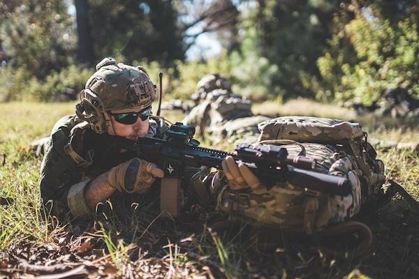


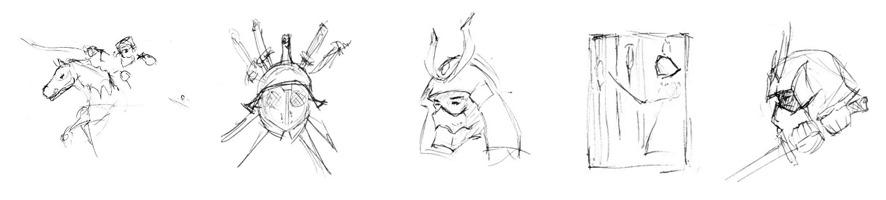
I felt the eye-level profile view was a little boring, so I sketched out a more interesting angle and played around with adding other elements—lotus flowers and smoke.
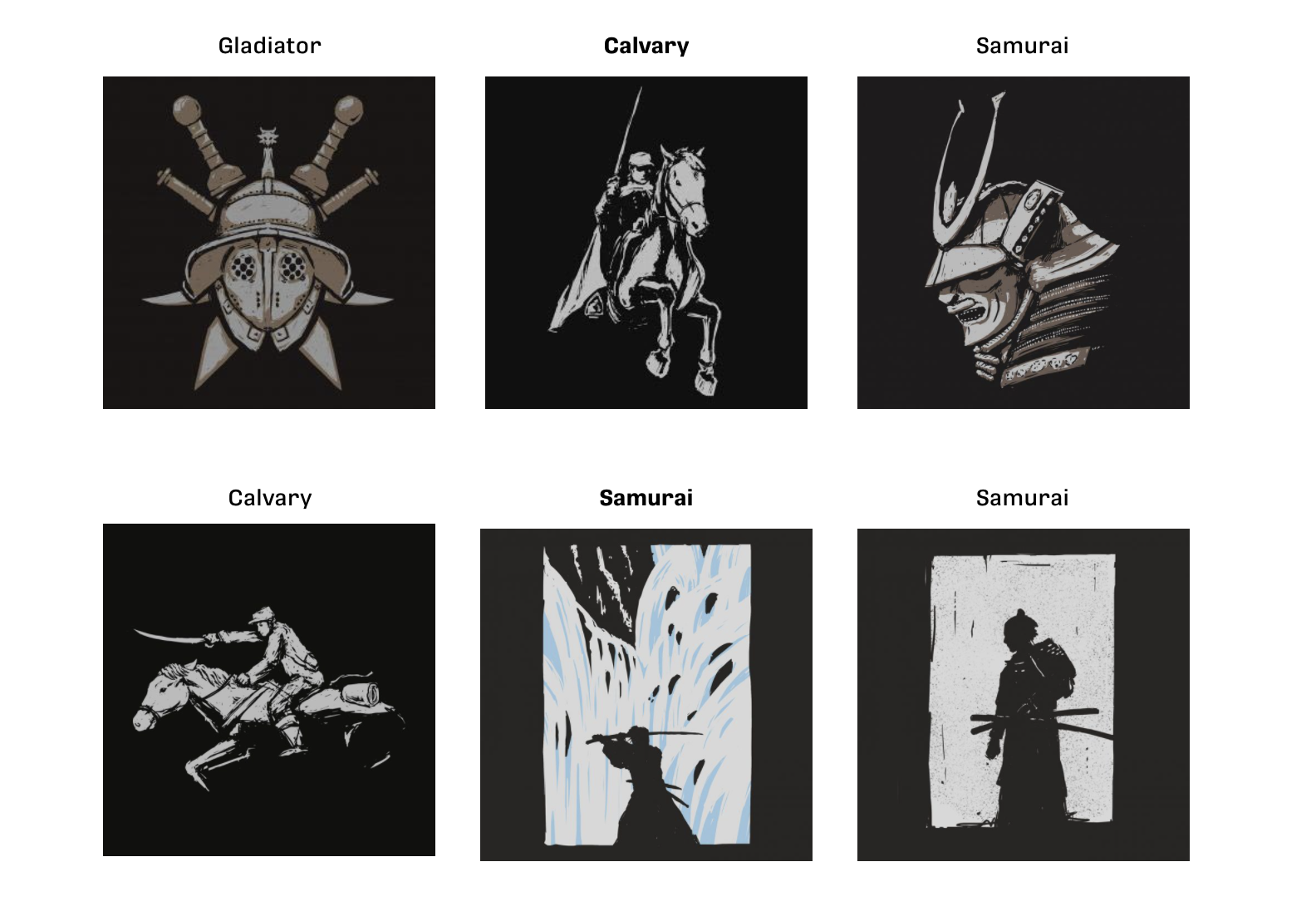
Working on this design was as difficult as it was fun. I really wanted to push the detail much further than any other ADS shirt design I’ve done in the past while also making sure the image was immediately recognizable.
Adding the smoke ran the risk of making the design too busy, but after some work I think it helped add some much-needed dimension, making the helmet look less flat.
Two BIG problems came to light at this point:
- First, the mask looks like a smile instead of snarl…not exactly intimidating.
- Second, the helmet tie-down looks like a noose, which is not the intention.


